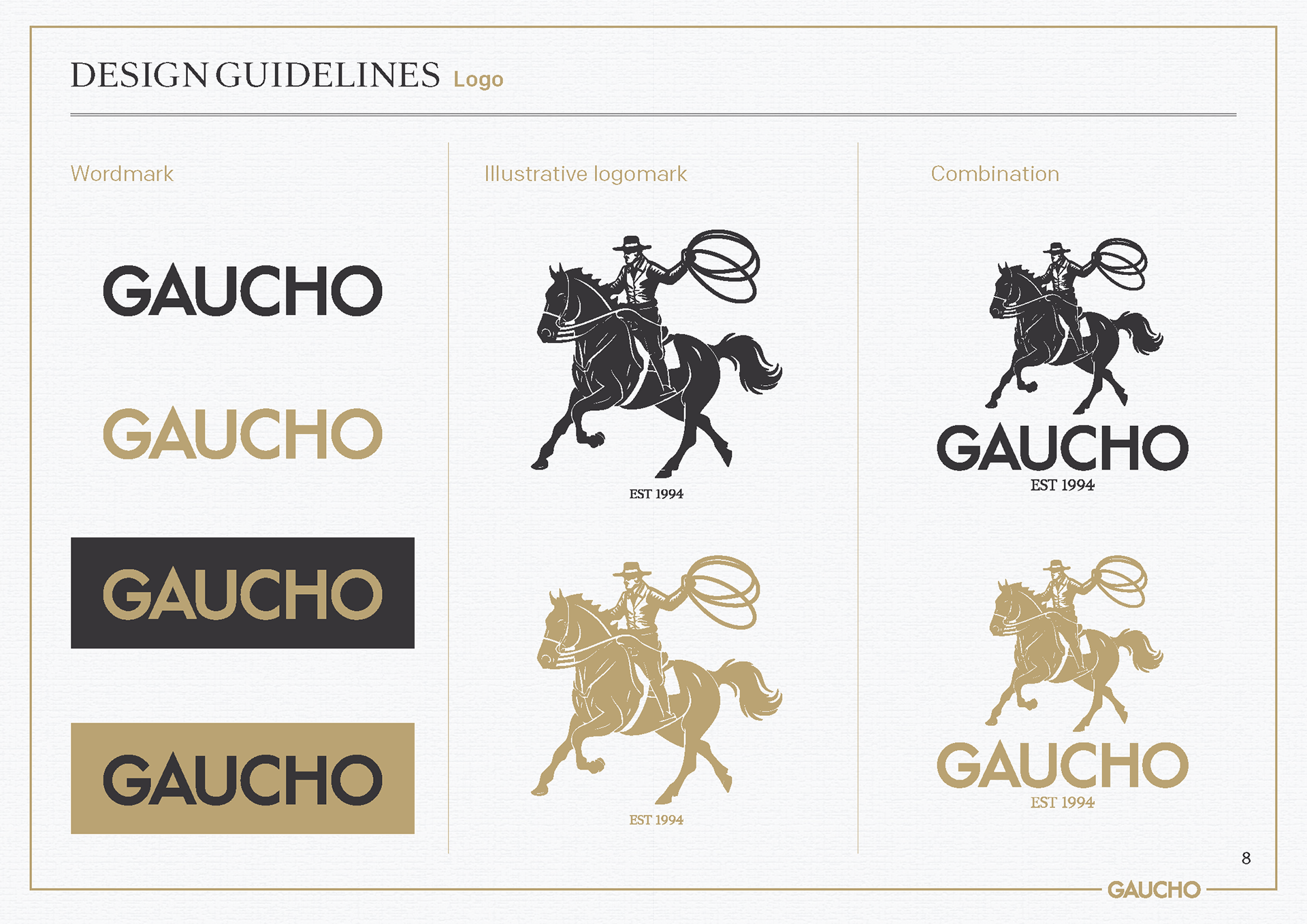
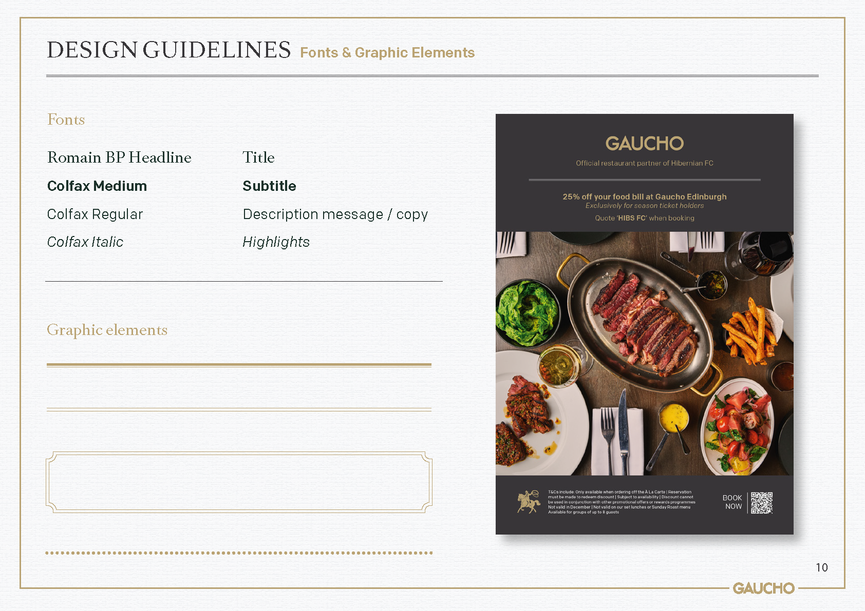
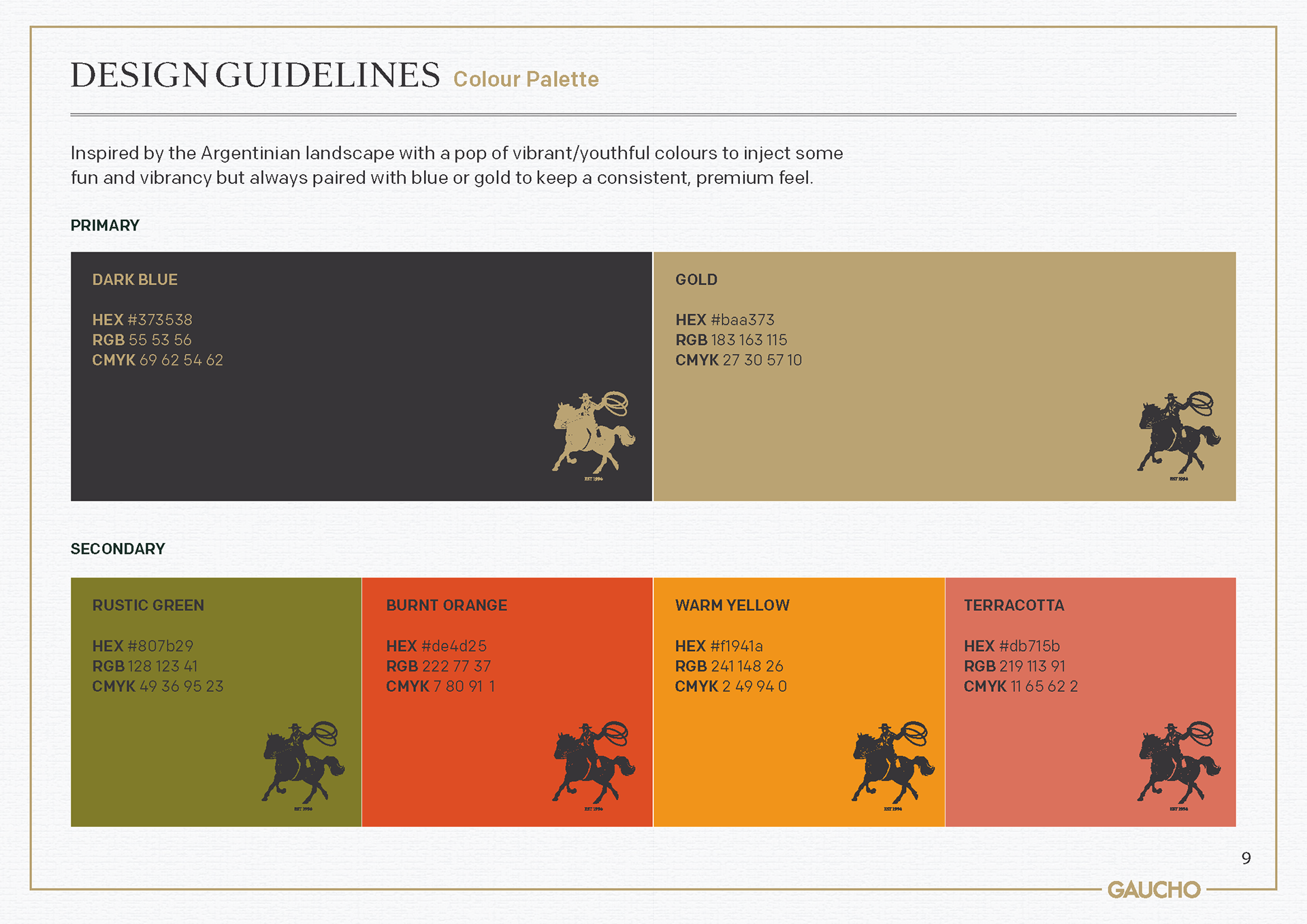
This evolution of Gaucho's branding was designed to better showcase the brand's rich heritage and improve visual storytelling. To achieve this, an illustrative logomark was created to better communicate the idea of the typical Argentinian Gaucho, a clear nod to the origin and inspiration behind the restaurant group. This was combined with a refreshed colour palette that speaks to the earthy richness and sunshine vibrancy of Argentina.
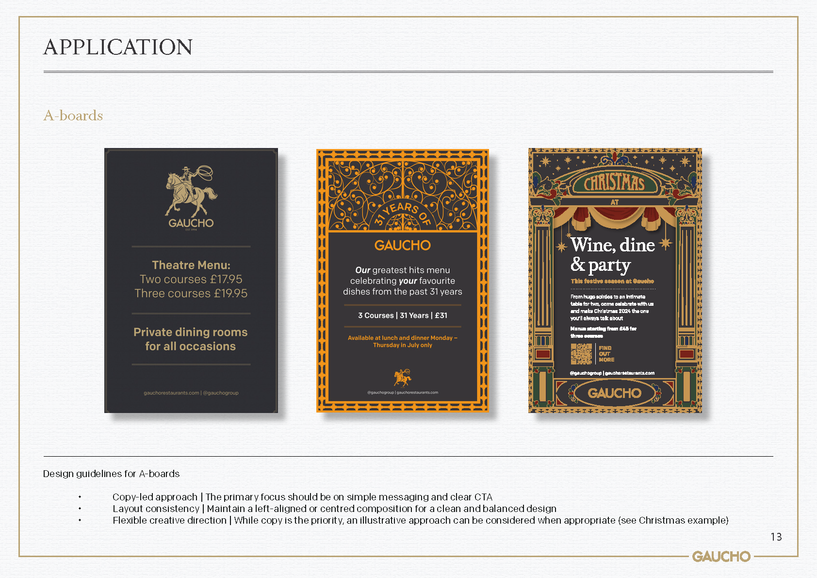
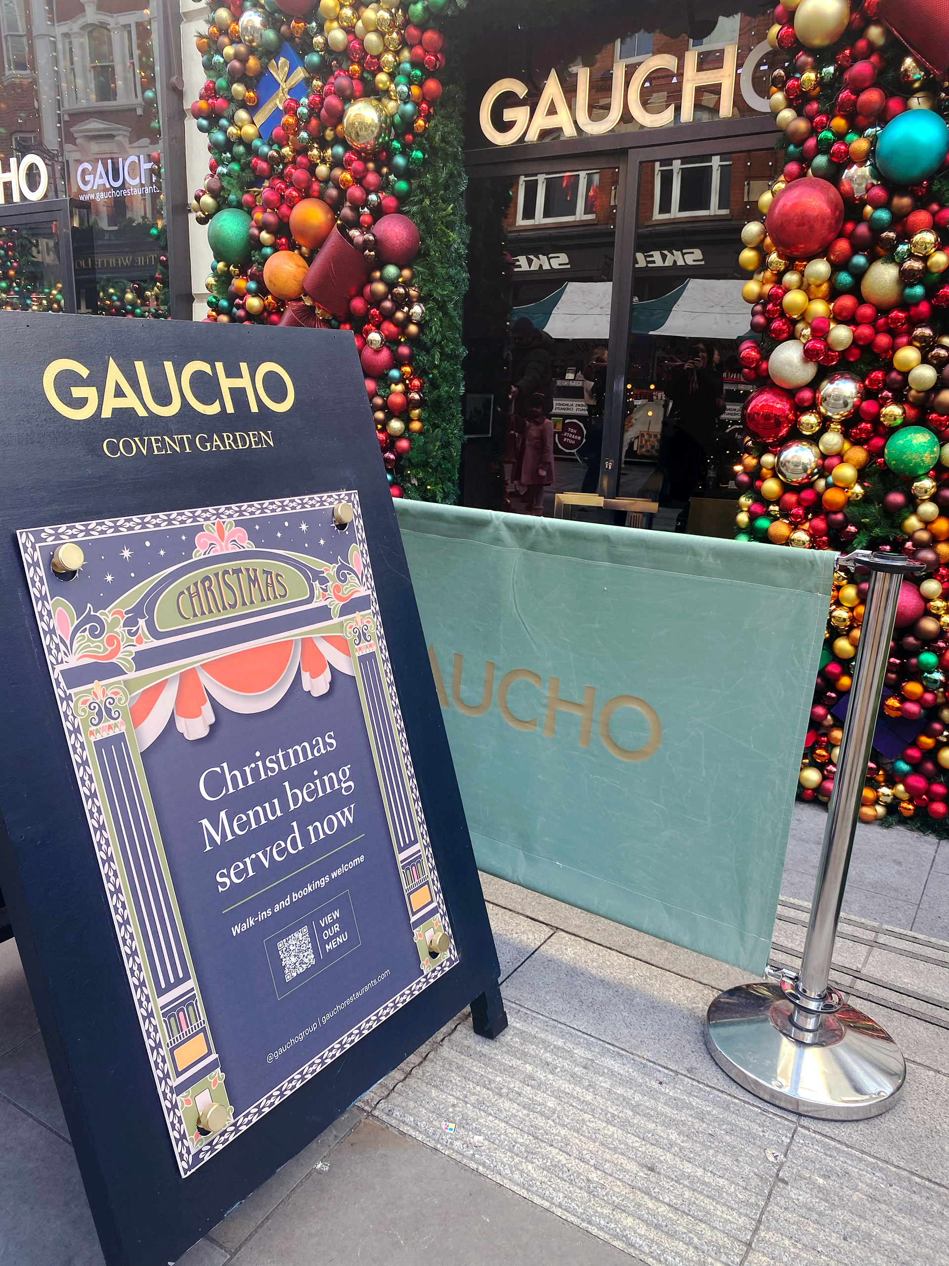
Christmas A board outside Covent Garden
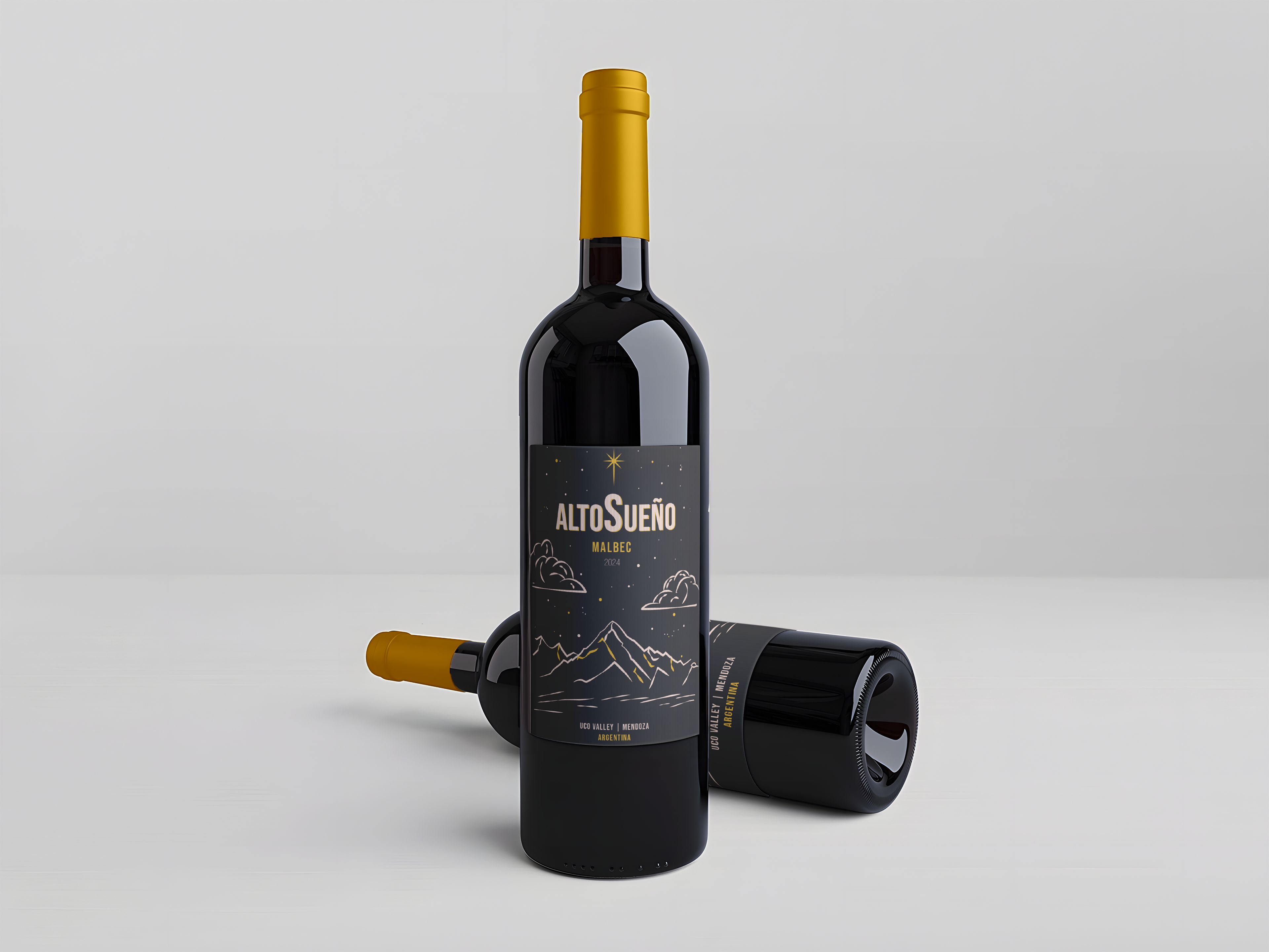
Alto Sueno - an Argentinian entry level Malbec. Working in collaboration with a UK based supplier to create a wine with a smaller carbon footprint.
The brief was to create a label for this that felt premium, crafted and reflected the origin of the product whilst still feeling friendly and approachable. The rough translation of Alto Sueno, which means 'higher dreams' also informed the design choices for this project.
This is now available in all Gaucho restaurants.